

Key Takeaways
- The wall you choose matters as much as the colour or material you apply to it.
- Colour contrast should be noticeable but not jarring relative to the surrounding walls.
- Texture adds depth without the commitment of a strong colour change.
- Lighting conditions in a room directly affect how any accent wall colour reads.
- Scale the pattern or texture to the size of the wall to avoid a cramped or sparse result.
Accent wall
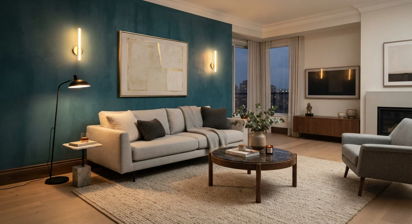
An accent wall is a single wall in a room treated differently from the others, through paint colour, wallpaper, paneling, or another material. The goal is to create a visual focal point that draws attention to a specific part of the space. When done well, it makes the whole room feel more intentional and designed.
In interior design, a focal point is a dominant element that anchors the eye. An accent wall works best when it aligns with an existing architectural feature or natural sight line.
Why most accent walls fall flat
The most common mistake is treating an accent wall as a decoration decision rather than a spatial one. Choosing a colour because it looks good on a swatch card, then applying it to a random wall, rarely produces the effect people expect. The wall becomes loud without becoming interesting.
An accent wall works when it amplifies something the room already has: a fireplace, a bed headboard position, a recessed alcove, or an entry sight line. Without that anchor, the feature wall competes with the furniture instead of framing it.
The second common problem is contrast that is either too subtle or too extreme. A wall one shade darker than the others reads as a mistake. A wall that is five shades darker than everything else in a neutral room can feel isolated rather than integrated.
Choosing the right wall
Walk into the room and stop at the threshold. The wall your eyes settle on first is your candidate. In most rooms, that is the wall directly opposite the entry point, or the wall behind the dominant piece of furniture.
Walls that are interrupted by multiple windows, doors, or built-in shelves are poor choices. Interruptions break the visual surface and prevent the treatment from reading as a cohesive feature. A solid, unbroken wall gives any colour or texture room to land.
Architectural features strengthen the logic of a choice. A chimney breast, a recessed sleeping nook, or a half-wall already signals "look here" to anyone in the room. Treating that surface as the accent wall confirms what the architecture is already doing, rather than fighting it.
For bedrooms, the wall behind the bed is standard for a reason: it frames the focal point of the room and is visible from the doorway. For living rooms, the wall behind the sofa or the one hosting a media unit both work. See layout strategies for small bedrooms if you are working with limited floor space and need to be careful about how a feature wall reads against compact furniture.
Colour principles that hold up in practice
Test before you commit
Paint a section of the actual wall at least 12 inches by 12 inches and observe it across morning, afternoon, and evening light before purchasing full quantities. Colours shift significantly between artificial light and daylight, and between north- and south-facing rooms. This step takes minutes and can prevent an expensive repaint.
Colour temperature matters more than shade alone. Warm accent colours (terracotta, ochre, warm red) advance toward the viewer, making the wall feel closer. Cool colours (deep teal, slate blue, forest green) recede, which can make a wall feel farther away and a room feel wider. Use this deliberately: a warm accent wall behind a bed creates intimacy; a cool one in a narrow corridor can ease the feeling of compression.
The relationship between the accent wall and the surrounding walls needs intention. A monochromatic approach uses different values of the same hue, which reads as sophisticated and low-risk. A complementary approach pairs colours from opposite sides of the colour wheel, which is higher contrast and requires more confidence in execution. An analogous approach takes colours adjacent on the wheel, producing a cohesive but varied palette.
Natural light changes every colour. A north-facing wall receives cool, indirect light that will make any colour look flatter and cooler than the paint chip suggests. A south- or west-facing wall gets warm afternoon light that intensifies warm tones and softens cool ones. Paint a large swatch directly on the wall and observe it at different times of day before deciding.
For painting technique once your colour is confirmed, professional interior wall painting practices covers the preparation steps that determine whether the finish looks clean or patchy.
Texture as an alternative to colour
Texture changes a wall without the colour commitment. Limewash paint produces a mottled, layered surface that catches light differently throughout the day. Board-and-batten adds geometric structure that reads as architectural detail. Textured wallpaper can introduce pattern, depth, or material character, from grasscloth to embossed geometric prints, without permanent alteration.
The scale of a texture must match the wall. Fine, closely spaced patterns on a large wall look busy and visually noisy. Wide-plank shiplap on a small bathroom wall can feel heavy. A general principle: the smaller the wall, the simpler the texture or the larger the individual repeat.
Texture also works well as a complement to a subtle colour shift rather than as a standalone. A warm white limewash on a wall that would otherwise be flat white adds depth without any colour contrast at all. That approach is especially useful in rooms where you want visual interest without committing to a distinct hue.
For compact spaces where wall treatments need to do more work, small bathroom upgrades with visual impact outlines how surface changes affect perceived size.
Making the accent wall work with the rest of the room
An accent wall does not exist in isolation. The colour or texture must connect to at least two or three other elements in the room, through cushions, artwork, a rug, or a furniture finish. Without that repetition, the wall reads as an afterthought. With it, the room feels deliberate.
Lighting affects the integration. A wall sconce or picture light directed at the accent wall gives it presence after dark and in the daytime. Without any dedicated light, a dark or textured accent wall can disappear in low-light conditions, losing the effect entirely.
If you are treating the project as part of a broader weekend renovation, weekend projects that transform a room puts accent walls in context alongside other achievable one- or two-day improvements.